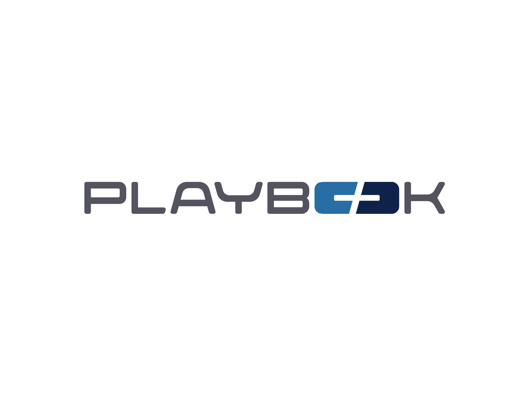
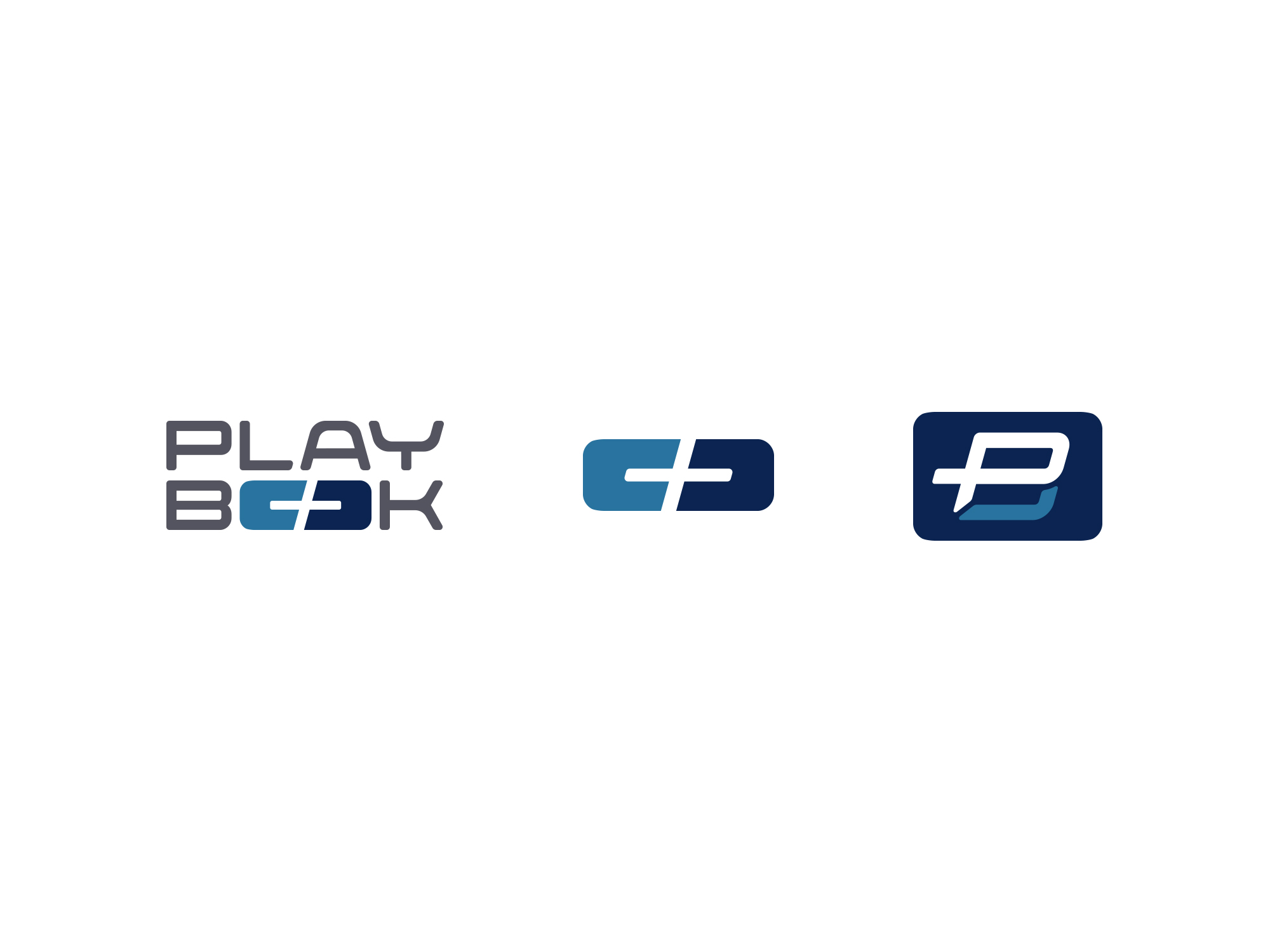
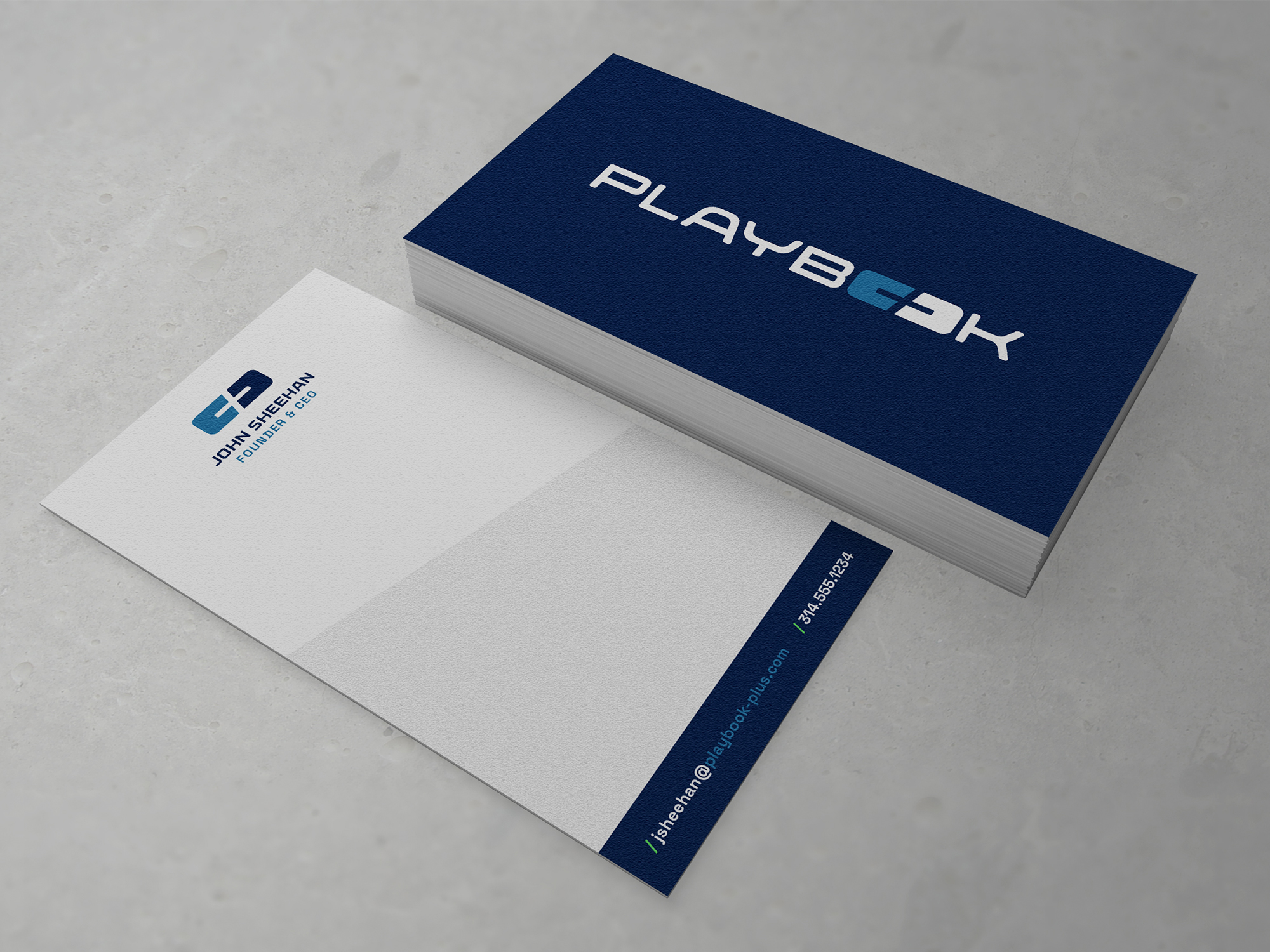
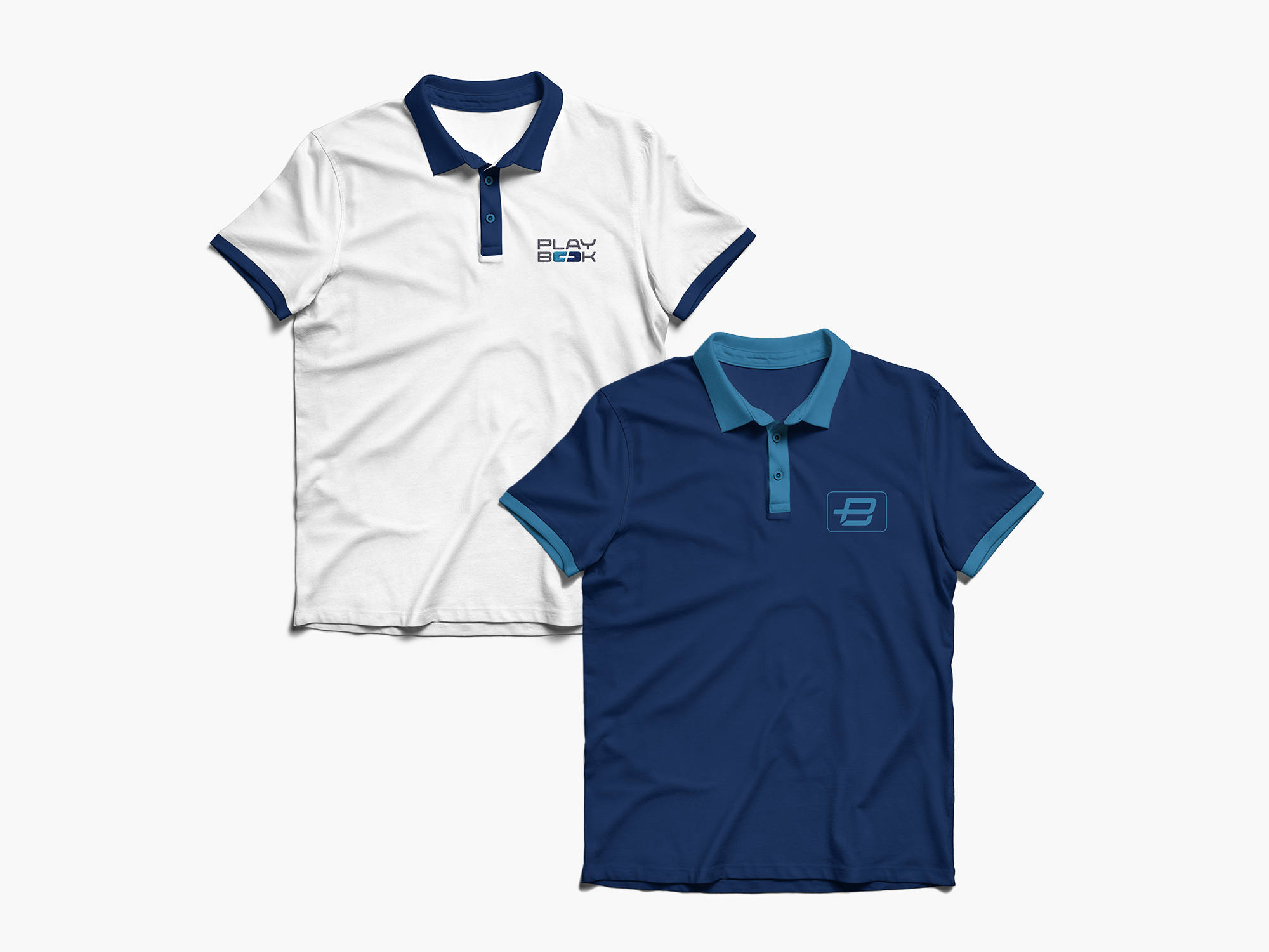
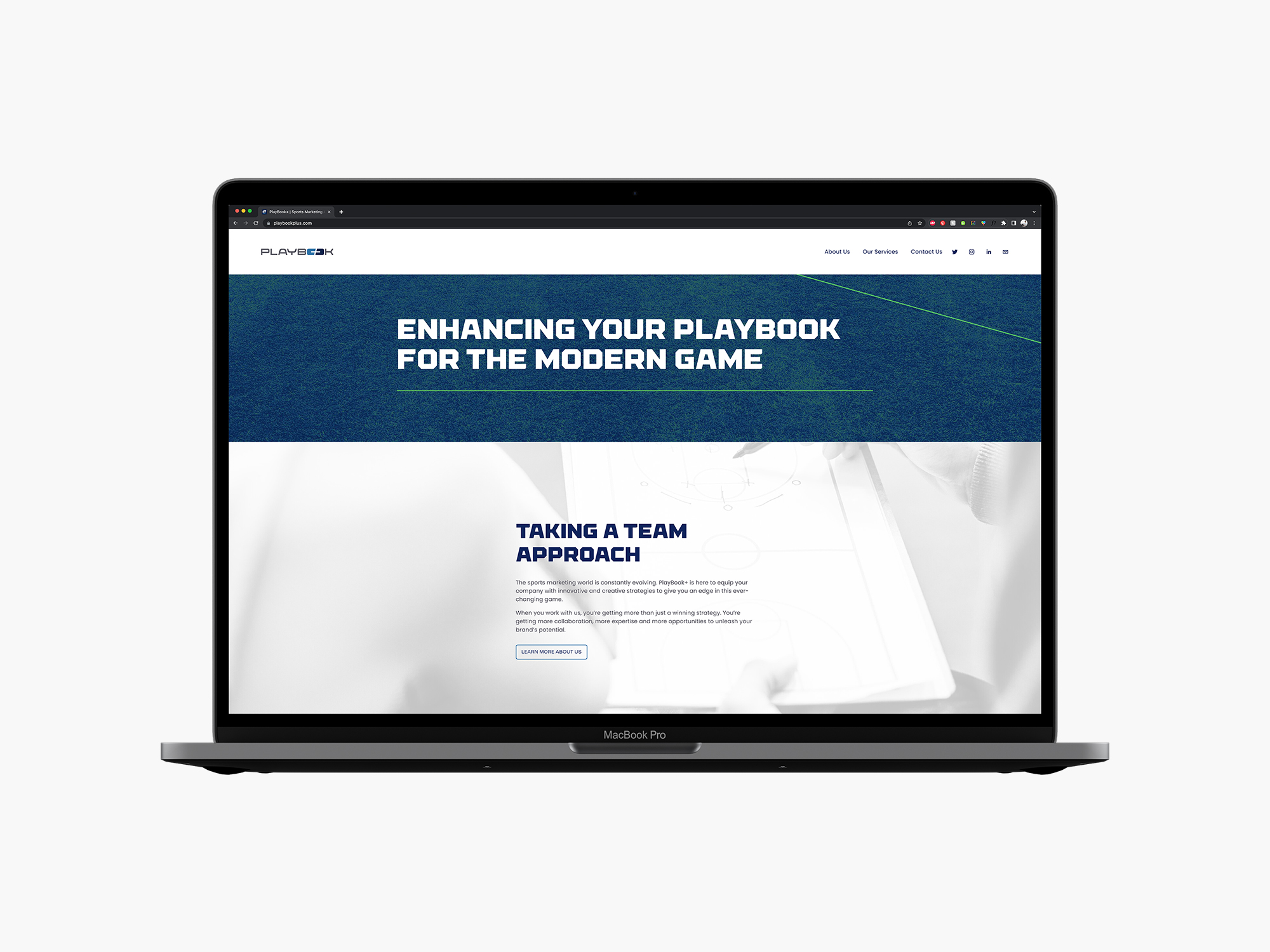
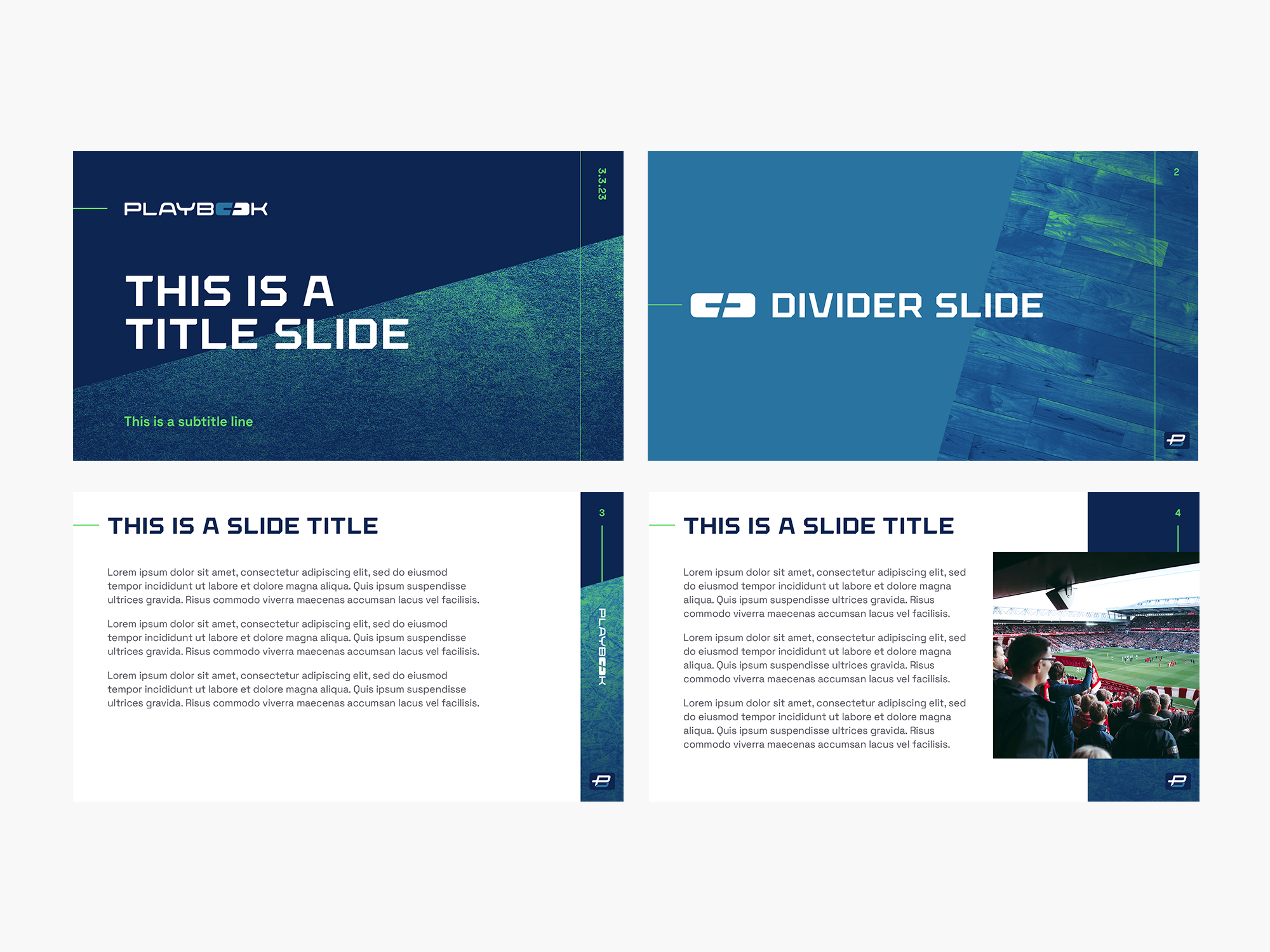
Branding done for a sports marketing agency based out of St. Louis, MO. The primary wordmark has two versions in order to adapt to any scenario – much like a top-of-the-line athlete.
To mimic the decades of experience and exciting energy of the founders
of PlayBook+; the brand uses a proven color palette of navy and gray as a base with a lime green that adds vibrancy and edge.
Sidelines and angled graphic elements with sport fields' textures round up the athletic nature of the brand, while setting it apart from other
competitors.